Why this exists
I thought this would be a cool data visualization exercise for something that has increasingly been a contentious issue for American supply chains and national security: who actually controls the critical minerals behind batteries, chips, and the AI buildout.
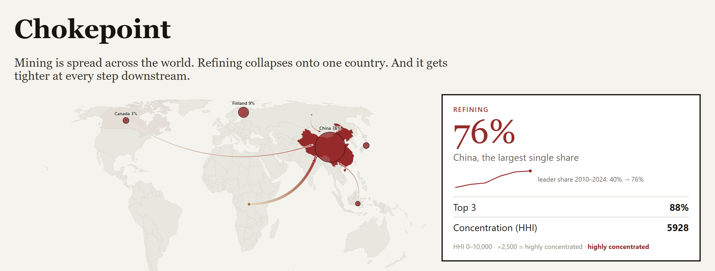
The reporting I’d read tended to stop at mining, which is the wrong place to look. I wanted to see the whole chain in one picture, and let the geography make the argument.
What it does
An interactive world map of the minerals behind the AI and energy buildout: lithium, cobalt, nickel, manganese, graphite, rare earths, gallium, germanium, and copper.
- A stage stepper walks the value chain: reserves, then mine production, then refining
- Each stage repaints the map, sized by each country’s share, so concentration is visible at a glance
- A year slider scrubs 2010 to 2024 to show how the picture shifted over time
- On the refining stage, flow arcs trace mined material to where it gets processed
- A concentration index reads out the top-1 share, top-3 share, and an HHI score with a plain-language band
- A per-mineral panel breaks down mining versus refining side by side, with sources on every figure
How it works
- Curate the data: Each mineral is a hand-built dataset of country shares at six year marks, sourced from USGS Mineral Commodity Summaries and the IEA Critical Minerals Outlook.
- Validate it: A check enforces that every stage and year sums to roughly 100, so a typo can’t quietly skew the map.
- Interpolate between marks: Real data exists only at six years; the slider interpolates the years in between, and the UI flags that those are estimates, not measurements.
- Render with D3: An Equal Earth map, share-scaled markers, great-circle flow arcs, and a choropleth that recolors by the active stage.
- Color carries the thesis: Each stage has its own hue, cool to hot, so stepping downstream visibly heats up the map as the supply chain concentrates.
What’s next
- Add a strategic-criticality tier. Since I’m most curious about the national security side, I’d categorize the minerals by how important they are and will be going forward, not just how concentrated they are today.
- Layer in the deep-sea frontier as a contested next source, tied to the international seabed governance gap.
- Weight the “All materials” view by production value instead of treating every mineral equally.
What I learned
I went in assuming mining was the chokepoint. It isn’t. A country can dig up almost none of a mineral and still control it, because the real leverage is in refining, and that collapses onto one country far harder than extraction does.
So the usual answer, open more mines in friendly countries, mostly misses the point. If the ore still gets shipped to the same place to be processed, the dependency hasn’t moved. The bottleneck is a chemistry and capacity problem, not a geology one.
Status
Shipped and live. Mine and reserve figures for all nine minerals are sourced to USGS Mineral Commodity Summaries at six year marks. Refining shares are sourced where country-level data exists and labeled as estimates where it doesn’t, so no number pretends to be more certain than it is.